
I've been inspired lately by street art. It pops up in the most unexpected places and its impact is insistent and passionate. Bright colors, political messages, masterful illustrations, and random clusters of stickers, all beckon for your attention to seen and remembered.
When I first began developing the idea of The Femme Project, three words popped into my head: kiss pop fuck. Each of the words is representative of a messaging concept for distinct collections of The Femme Project art. The resonant words became a tagline, the tagline became a hashtag, and the hashtag begged to be seen and heard. The dusty marketing wheels started turning, and the idea of creating a visual, iconic representation was conceived.
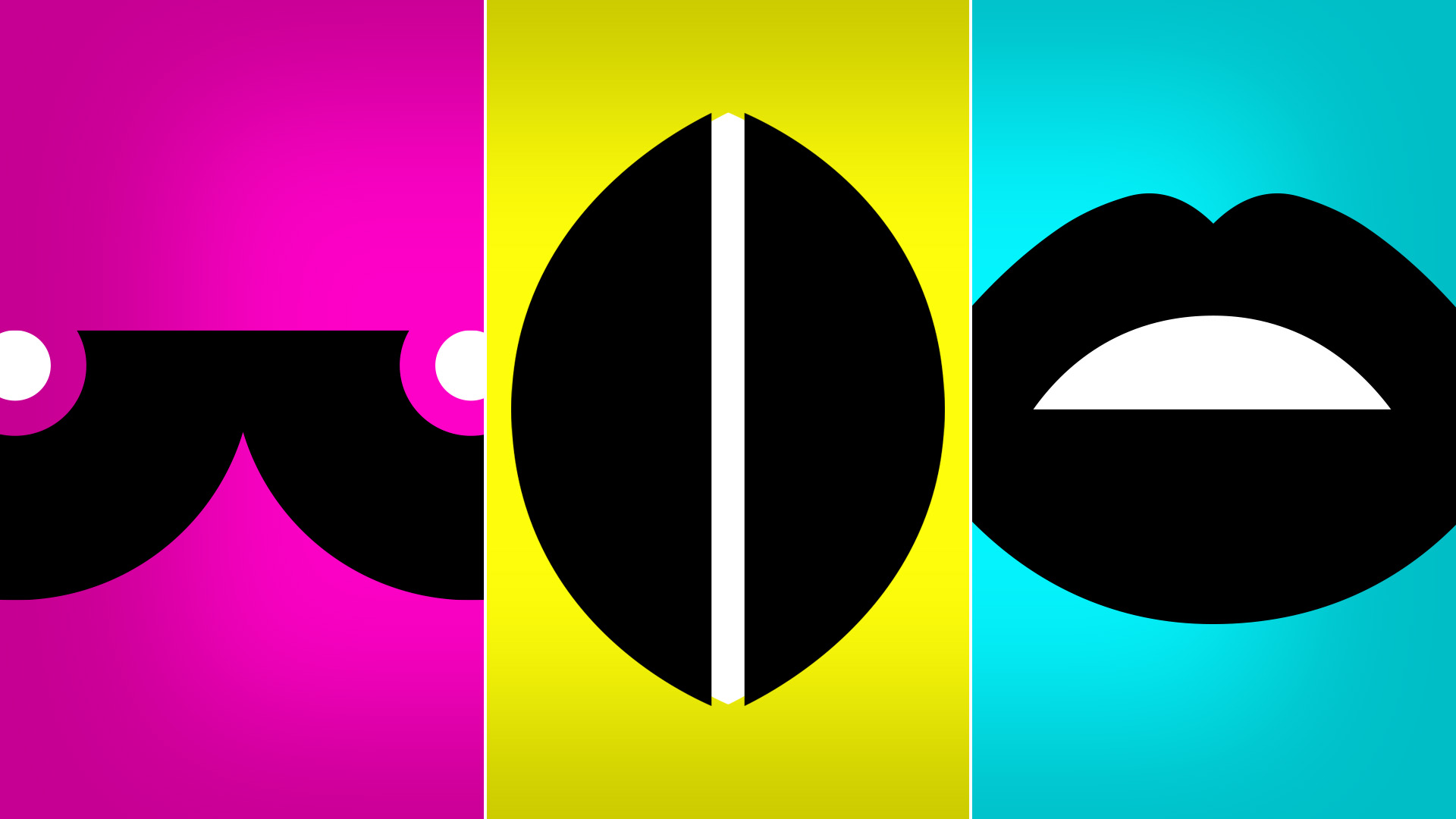
Simplicity and consistency make me happy. I enjoy the challenge of plucking a concept out of the air and breaking it down into its simplest, essential parts and positioning it anew. I began by illustrating graphical images of women's anatomy: breasts, vagina and mouth. Each body part symbolizes the various aspects of Kiss, Pop, Fuck. The breasts are indicative of motherhood, femininity, and the softer aspects of being a woman. The vagina represents the sexual spirit and appetite of being a woman. And, the mouth speaks for itself - the right of women to speak up, stand up and voice our beliefs, opinions and injustices.
Next, was color. Pulling from my print design background, a simple but bold palette was needed...pure CMYK. In print and in web, I wanted the color to be intense, demanding, predictable and consistent. Cyan, magenta, yellow and black are the perfect mix.
The next phase awaits production. Taking a page from the street art playbook, I love the viral nature of stickers. Who knows where #kisspopfuck might pop up next? On your neighbor's bumper...on the transformer downtown...on the light pole across the street...I think the world is ready for a femme invasion.